

In this article, I’m going to introduce how to create line charts with WordPress.
What is a line chart?
A line chart is a chart type that uses two axes perpendicular to each other. The vertical axis shows a quantitative value, and the horizontal axis indicates a progression over time.
Line charts can exceptionally represent categories on the x-axis. However, bar charts are more appropriate for this use case. For general recommendations on what to consider when creating line charts check out this in-depth article.
How to create a line chart with WordPress?
There are various ways to create line charts with WordPress. One method is to build line chart images on a spreadsheet editor or with graph generators and then insert them in your blog post. However, if you want interactive, and easy-to-update line charts, the best way is to use WordPress plugins.
With plugins, the chart creation process usually involves selecting a chart type and inserting the data from a dedicated plugin interface. In addition, more advanced chart plugins can usually use data available on external data sources, like a JSON resource, a CSV file, a database, etc.
Popular plugins that you can use to create line charts are wpDataTables, Visualizer, and UberChart. For the rest of this tutorial, I’ll be covering the step-to-step configuration of a simple line chart with the UberChart plugin.
Create a simple line chart
Before starting, you have to install the UberChart plugin on your WordPress site. UberChart is a premium plugin available for purchase on Envato Market. This plugin integrates a spreadsheet editor for fast data handling, the ability to use an external data source, ready-to-use templates for rapidly creating charts, and a high number of customization options.
The basic line chart creation process with UberChart involves two simple steps:
Step 1: Create a new chart
Access the plugin dashboard via UberChart -> Charts from the WordPress side menu. This is where you should come to create, edit, or delete charts.
In the dashboard, you’ll see the list of existing charts (or presets if you just installed the plugin). Just below, there is a form where you can create new charts or edit existing ones.
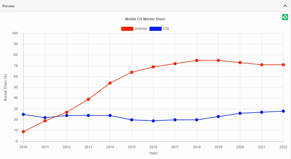
In the example below, I entered data related to the mobile OS market share from 2010 to 2022 in the built-in spreadsheet editor.
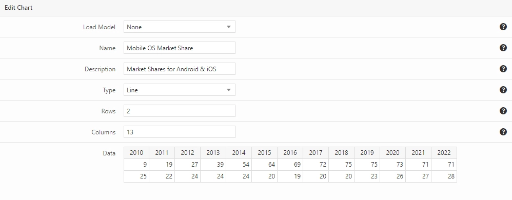
Note that you can easily see how your chart looks by expanding the Preview section. You can also refresh the chart when needed to see the configuration changes applied.
Below the preview are several accordion menus for further customizations. Once you have done click Add Chart button to save your chart.
Step 2: Display the chart on a post
UberChart provides two ways to display charts on WordPress content. The main method is to use the dedicated block available in the block editor. Classic editor users or users with alternative visual editors can also use shortcodes as a fallback.
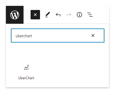
If you are using the block editor, click the plus sign and search for the UberChart block. Then use the selector to choose the chart, in this case named “Mobile OS Market Share”.
To conclude, publish or update the post/page and visit it for the results.
Apply advanced customizations
In terms of customization, you can style your line charts and individual datasets with various options within the plugin. This includes curved or straight lines, data point style (circle, triangle, cross, etc.), and set radius and border. You can also customize colors for lines, data points, charts, and legends. Let’s see some of the advanced customization options.
Customizing line chart datasets
The plugin gives you the ability to customize each dataset of the chart. You can access the dataset options by selecting a cell that belongs to the dataset.
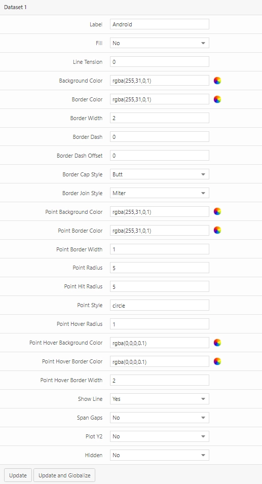
After you’re done with the dataset customization, click Update to apply changes to the individual dataset or Update and Globalize to apply the new settings to all datasets at once.
Getting the line chart data from external sources
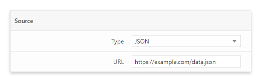
UberChart allows you to generate the line chart from an external data source provided in JSON format.
To configure this feature, publish your JSON data source in a public URL and enter the URL in the Source section.
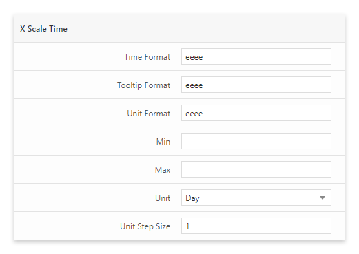
Setting up a time scale
Most of the models provided by UberChart to configure a line chart already use a time scale. However, if you want to configure a time scale manually, you can do so in the X Scale Time section.
When configuring a time scale for you line chart it’s important to set the proper time format. The plugin uses the date-fns date library and the time format should use Unicode tokens.
Line charts with logarithmic scales
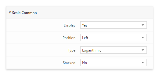
The line chart becomes difficult to read when there is a big difference between the lowest and the highest data points.
To solve, you can switch the scale of the vertical axis from linear to logarithmic. This can be done in UberChart with the Type option available in the Y Scale Common menu.
Enable a secondary axis
The plugin gives you the ability to create a line chart with a secondary Y-axis. To do so, open the options of the dataset that you want to assign to the secondary axis and enable the Plot Y2 option.
Area charts
Area charts are similar to line charts. The only difference is that the area from the line to the x-axis is filled with a color. It’s easy to convert a line chart to an area chart. Just set the dataset option Fill to “Yes” and select an appropriate Background color.
If the area chart includes multiple datasets, it’s usually recommendable to set translucent colors for the background color of each dataset. You can achieve this by submitting a color with the RGBA format.
Creating line charts from templates
UberChart is extremely powerful but might also be intimidating for new users. If you are struggling with its settings, you can use the ready-to-use chart templates named “Models” at any time.
Use this feature to create simple line charts or more complex configurations like area charts, curved line charts, line charts with logarithmic scales, multi-axis line charts, and more.
Final thoughts
In this article, we went through the notion of line charts and learned how to create them with WordPress using the UberChart plugin.
Line charts are an excellent way to visualize value changes, identify trends, compare multiple values, and estimate future changes.
The best method to add line charts on WordPress is to use a chart plugin. With plugins, you can easily customize the chart as well as maintain and update the chart quickly.