Customizing the Style
The plugin has a large set of style options to match the cookie notice, the cookie settings window, and the revisit consent button to the design of your site. This article explains how the options are organized and shows the options to change for the most common customizations.
The style options are in Cookie Notice → Options → Style. The font families are in Options → Advanced → Fonts.
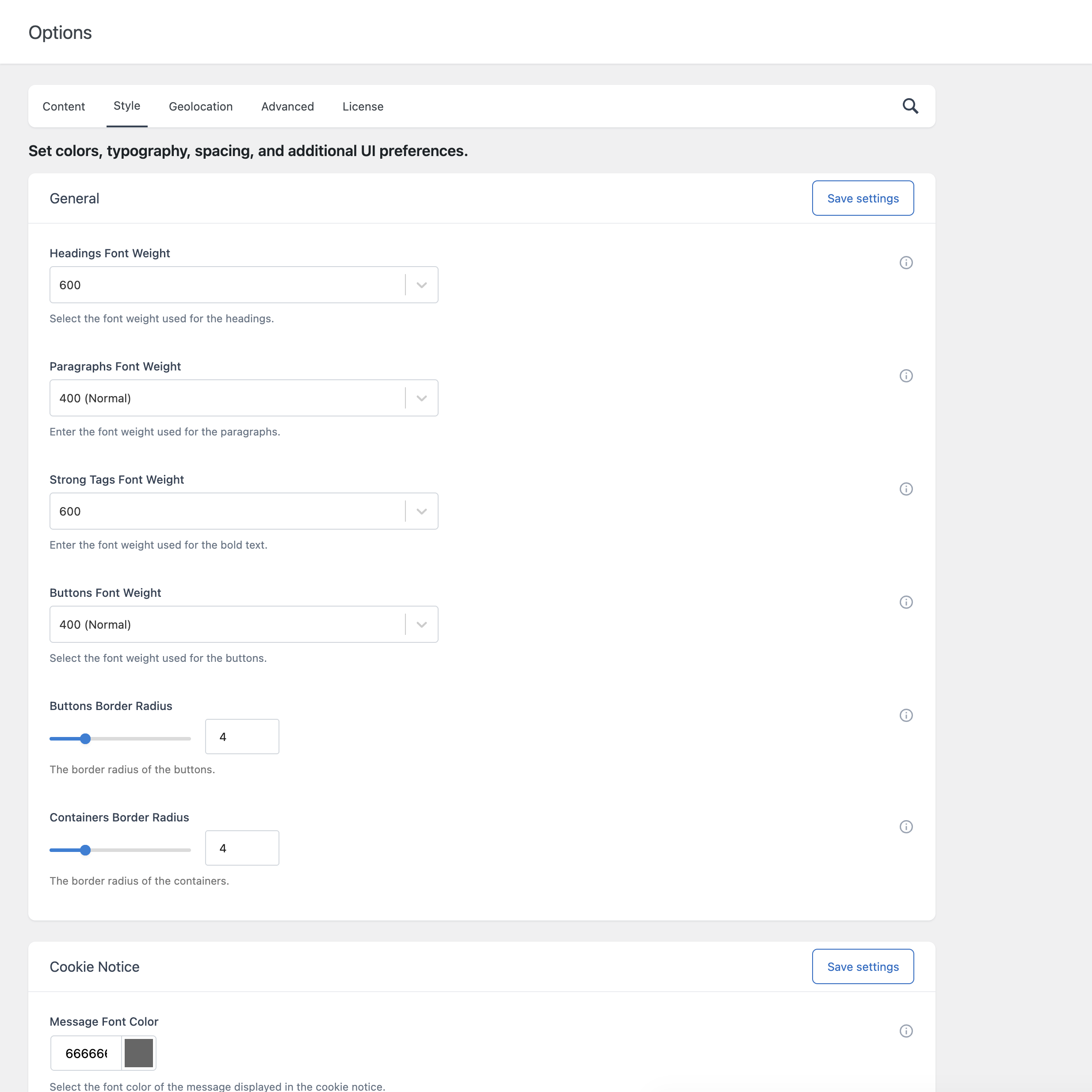
How the Style tab is organized
| Section | What it controls |
|---|---|
| General | Font weights and border radius, shared by the notice and the cookie settings window. |
| Cookie Notice | Colors, position, width, border, drop shadow, and mask of the cookie notice. |
| Cookie Settings | Colors, border, drop shadow, and mask of the cookie settings window. |
| Revisit Consent | Position and colors of the revisit consent button. |
Each option has a tooltip. Move the pointer over the question mark next to the option to read it.
Click Save settings to apply your changes. If you use a caching plugin, clear its cache to see the changes on the front end.
General
| Option | Description |
|---|---|
| Headings Font Weight | The font weight of the headings. |
| Paragraphs Font Weight | The font weight of the paragraphs. |
| Strong Tags Font Weight | The font weight of the bold text. |
| Buttons Font Weight | The font weight of the buttons. |
| Buttons Border Radius | The roundness of the button corners, from 0 to 16 pixels. |
| Containers Border Radius | The roundness of the corners of the notice and of the window, from 0 to 16 pixels. |
Cookie Notice
Text
- Message Font Color and Message Link Font Color.
Buttons
Each of the three buttons has six color options, for the normal state and for the hover state:
| Option | Hover variant |
|---|---|
| Button 1 Background Color | Button 1 Background Color Hover |
| Button 1 Border Color | Button 1 Border Color Hover |
| Button 1 Font Color | Button 1 Font Color Hover |
The same options exist for Button 2 and Button 3. Dismiss Button Color sets the color of the dismiss icon.
Container
| Option | Description |
|---|---|
| Container Position | Top, Center, or Bottom. |
| Wrapper Width | The width of the content of the notice, in pixels. |
| Container Background Color, Container Opacity | The background of the notice. |
| Container Border Width, Container Border Color, Container Border Opacity | The border of the notice. |
| Container Drop Shadow, Container Drop Shadow Color | The shadow of the notice. |
| Mask, Mask Color, Mask Opacity | The layer displayed over the page behind the notice. See Configuring the Cookie Notice. |
Cookie Settings
| Group | Options |
|---|---|
| Buttons | Background, border, and font colors of Button 1 and Button 2, each with its hover variant. |
| Text | Heading Font Color, Paragraphs Font Color, Links Font Color. |
| Toggles | Toggle On Color, Toggle Off Color, Toggle Mixed Color, Toggle Disabled Color. |
| Container | Container Background Color, Container Opacity, Container Border Width, Container Border Color, Container Border Opacity, Container Drop Shadow, Container Drop Shadow Color. |
| Details | Container Highlight Color and Separator Color. |
| Mask | Mask, Mask Color, Mask Opacity. |
Revisit Consent
| Option | Description |
|---|---|
| Position | Left or Right. |
| Background Color | The background color of the button. |
| Icon Color | The color of the icon. |
Fonts
The font options are in Options → Advanced → Fonts.
| Option | Description |
|---|---|
| Google Fonts Embed Code URL | The URL of the Google Fonts stylesheet loaded by the plugin. |
| Headings Font Family | The font family of the headings. |
| Paragraphs Font Family | The font family of the paragraphs. |
| Buttons Font Family | The font family of the buttons. |
By default the plugin loads the Open Sans font from Google Fonts and uses it for all the texts.
Use a different Google font
- On the Google Fonts site, select the font and copy the URL from the embed code. It looks like this:
https://fonts.googleapis.com/css2?family=Roboto:wght@400;700&display=swap- Paste the URL in Google Fonts Embed Code URL.
- Enter the font in the three font family options, for example:
'Roboto', Helvetica, Arial, sans-serif- Set the font weights in Style → General to weights included in the URL (400 and 700 in this example).
- Click Save settings.
Do not load Google Fonts
With the default settings, the browsers of your visitors request the font from the Google servers. To avoid this request:
- Clear the Google Fonts Embed Code URL option.
- Enter fonts available on your visitors’ devices, or the font already loaded by your theme, in the three font family options. For example:
Helvetica, Arial, sans-serif- Click Save settings.
Common customizations
Use your brand color
The default accent color is blue (#1e58b1). To replace it with your color, change these options.
Style → Cookie Notice
- Message Link Font Color
- Button 1 Border Color, Button 1 Border Color Hover, Button 1 Font Color, Button 1 Font Color Hover
- Button 2 Background Color, Button 2 Background Color Hover, Button 2 Border Color, Button 2 Border Color Hover
- The same options of Button 3, if you use it
Style → Cookie Settings
- Button 1 Border Color, Button 1 Border Color Hover, Button 1 Font Color, Button 1 Font Color Hover
- Button 2 Background Color, Button 2 Background Color Hover, Button 2 Border Color, Button 2 Border Color Hover
- Links Font Color
- Toggle On Color
Style → Revisit Consent
- Background Color
Create a dark notice
| Option (Style → Cookie Notice) | Example value |
|---|---|
| Container Background Color | #1d2327 |
| Message Font Color | #f0f0f1 |
| Message Link Font Color | #ffffff |
| Button 1 Background Color and its hover variant | #1d2327 |
| Button 1 Border Color, Button 1 Font Color and their hover variants | #ffffff |
| Button 2 Background Color, Button 2 Border Color and their hover variants | #ffffff |
| Button 2 Font Color and its hover variant | #1d2327 |
Give the same weight to Accept and Reject
To avoid making one choice more prominent than the other, give the accept and the reject button the same colors: copy the six color values of one button to the other.
Square or rounded corners
Set Buttons Border Radius and Containers Border Radius in Style → General. Use 0 for square corners.
Narrower notice
Reduce Wrapper Width in Style → Cookie Notice.
If your theme overrides the plugin style
Force CSS Specificity in Options → Advanced → Content is on by default. It adds !important to the CSS rules of the plugin, so the styles of your theme do not override them. Leave it on unless you want to override the plugin style with your own CSS. In that case turn it off and add your rules to your theme.
Mobile layout
The notice switches to its mobile layout below the width set in Responsive Breakpoint (Options → Advanced → Content). The default is 700 pixels.