

This article will cover how to hide images on mobile devices with WordPress.
Hide images on mobile devices with CSS
To hide images on mobile devices with CSS, we must use media queries. In particular, we can apply specific CSS rules based on the device width by targeting media features.
The example below uses the max-width range feature to apply CSS rules when the viewport value is equal to or below 480 pixels.
@media (max-width: 480px) {
	/* CSS rules applied only with mobile devices. */
}
Note that the examples in this section use 480 pixels as the threshold to differentiate a mobile device from a desktop device. However, you can change this value based on your specific needs.
Hide a specific image of the post
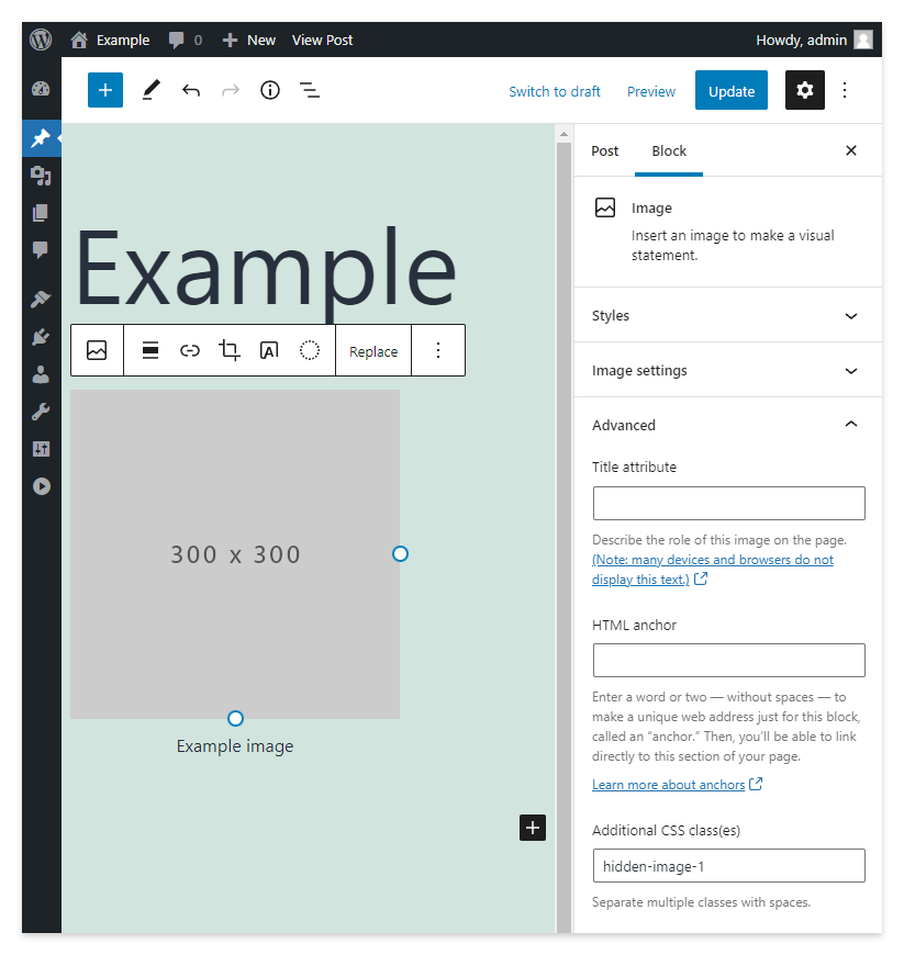
To hide a specific image, first, add a custom class in the Additional CSS class(es) field available in the sidebar of the Image Block.
Then in your theme stylesheet, add a CSS rule, conditionally applied with a media query, that hides the image associated with the custom class. Specifically, in the example below, I use the max-width: 480px media feature expression to apply the rule only when the viewport width is equal to or below 480 pixels.
@media (max-width: 480px) {
	.hidden-image-1 {
		display:none;
	}
}
After applying these changes, shrink your browser window (or test the page with a mobile device if your WordPress site is already on the web) to verify the changes applied with CSS.
Hide all the images in the post
WordPress always applies the wp-block-image class to the figure HTML elements that contain the images displayed in the articles. Consequently, we can target this class to hide all the images with mobile devices.
@media (max-width: 480px) {
	.wp-block-image {
		display: none;
	}
}
Hide images in the Widget area
WordPress 5.8 has introduced a new block-based widget editor. As a consequence, to hide a specific image, we can add a custom CSS class from the Image Block sidebar and then target this class with a CSS rule conditionally applied with a media query.
If instead, your purpose is to hide on mobile devices all the images in the Widget area, then you can target the widget-area class as in the example below:
@media (max-width: 480px) {
	.widget-area {
		display: none;
	}
}
Hide the post featured image
WordPress applies the attachment-post-thumbnail class to all the post thumbnails. Target this class to hide the featured image with mobile devices.
@media (max-width: 480px) {
	.attachment-post-thumbnail {
		display:none;
	}
}
Hide any image displayed on a WordPress website
If the image you want to hide is not associated with one of the classes added by WordPress, then you have to find the selector manually.
To find the selector, I recommend using Chrome DevTools. In particular, follow this guide to open the panel and this other guide to inspect the DOM nodes.
Note that if the image doesn’t have a specific selector, you can still create a selector that targets a particular image by including the element’s parents and tree-structural pseudo-classes if needed.
Switch an image with CSS
This part will show you how to display different images based on the user’s device. Precisely one for mobile devices and another for desktop devices.
Start by adding the two images in the post with the Image Block. Then with the Additional CSS class(es) field of the block, assign the desktop-image class to the first image and the mobile-image class to the second image. To conclude, create the CSS part and use two media queries. The first one targets mobile devices and applies a rule to hide the desktop image. The second one targets desktop devices and applies a rule to hide the mobile image:
/* Hide the desktop image with mobile devices */
@media (max-width: 480px) {
	.desktop-image {
		display: none;
	}
}

/* Hide the mobile image with desktop devices */
@media (min-width: 481px) {
	.mobile-image {
		display: none;
	}
}
Hide images on mobile devices with a plugin
Using a plugin is undoubtedly simpler than using code. So let’s see if we can find the best plugin for this specific purpose.
Restricted Blocks
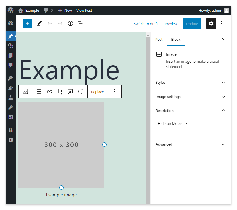
Restricted Blocks is a versatile plugin from our portfolio that you can use to hide or display the editor blocks based on custom criteria.
With this plugin, first, create a restriction of type Device in the dedicated menu and name it “Hide on Mobile”. Then select Mobile in the Device selector. Finally, in the post editor, select the image and assign the Hide on Mobile restriction.
Note that with this plugin, you can set the exact responsive breakpoint used to distinguish between desktop and mobile devices. The dedicated field to achieve this is named Responsive Breakpoint and is available in the advanced options.
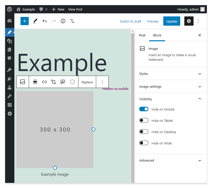
Responsive Block Control
This Responsive Block Control plugin adds a Visibility section to the block sidebar. In this section, the following toggles are available:
- Hide on Desktop
- Hide on Tablet
- Hide on Mobile
- Hide on Wide
Simply activate the Hide on Mobile toggle to hide an image with mobile devices.
Block Visibility
This Block Visibility plugin doesn’t give you only the ability to hide the blocks based on the devices but also to hide them based on other conditions.
To hide the block on mobile devices with this plugin, open the Visibility section and then the Screen Size subsection. Here activate the Hide on mobile toggle.

Hide images on mobile devices with alternative editors
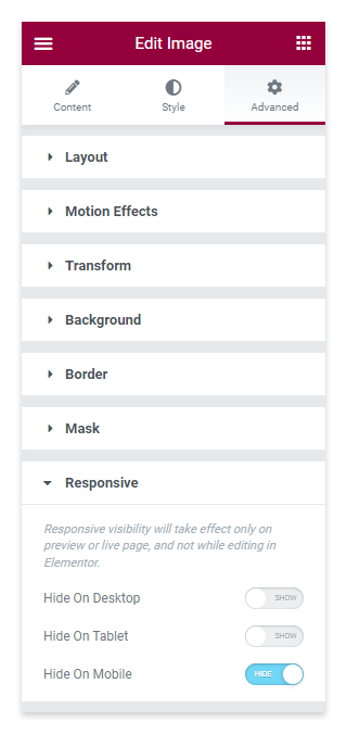
Elementor Website Builder
The Elementor Website Builder gives you the ability to manage the responsiveness of an image.
Follow this procedure to hide an image on mobile with Elementor:
- Add an Image widget from the Basic section of the catalog of widgets
- Edit the image
- Proceed to the Advanced section
- Open the Responsive section
- Click on the Hide On Mobile toggle
WPBakery Page Builder
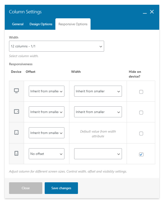
To do this with WPBakery Page Builder, you don’t have to modify the image settings directly. Instead, configure the column that contains the image. Let’s see the exact procedure:
- Open the column settings by clicking the pencil icon.
- Proceed to the Responsive Options tab
- In the row dedicated to the responsive option of the Phone device, activate the checkbox below the column named Hide on device?.
You should note that this procedure works with both the Backend and Frontend modes of the editor.
Classic Editor
The Classic Editor doesn’t have an option to alter the display status of the image based on the device. Consequently, we are forced to use CSS.
WordPress automatically applies a class to the post images that includes the prefix wp-image- followed by the image ID. For example wp-image-174. Specifically, you can find the actual class by temporarily switching the editor from Visual to Text.
Once you have the class of the image, you can hide it with mobile devices with the usual media queries used in the previous sections.
@media (max-width: 480px) {
	.wp-image-174 {
		display: none;
	}
}