

Web developers typically use a preloader on button click to provide visual feedback to the user that an action is being processed.
For example, when a user clicks on a button that initiates a long or complex operation, such as loading data from a server or performing a calculation, a preloader can be used to show that the operation is in progress and to prevent the user from interacting with the interface until the process is complete.
How to Add Preloader on Button Click in WordPress?
Creating a preloader on a button click event in WordPress requires custom development.
- Firstly, we need to create a button using some HTML magic. And don’t worry if you’re not a coding wizard, it’s not too difficult.
- Next, we’ll need to give that button some pizzazz with a touch of CSS because we want it to look good.
- In the end, we’ll add a small bit of JavaScript to bring our preloader animation to life.
With Elementor page builder, it’s even easier! Just drag and drop the HTML widget onto your canvas, and you’re ready to start coding. So, here we are using Elementor.

1. HTML Code
First things first, you gotta create a button using good old HTML. Once you’ve got that button up and running, you can start adding all sorts of fancy-schmancy preloader effects to it.
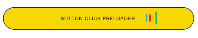
The HTML code is broken down into two parts: the button itself and the preloader animation. We’re keeping things simple by using four vertical lines for the preloader animation.
<a href="#" class="button loading">

   <!--First section starts here -->
   <span class="label">
   Button Click Preloader
   </span>

   <!--Second section starts here -->
   <span class="loading">
      <div class="bars">
         <div class="loading-bar"></div>
         <div class="loading-bar"></div>
         <div class="loading-bar"></div>
         <div class="loading-bar"></div>
      </div>
   </span>

</a>
2. CSS Code
Now, let’s style our button, so it looks visually appealing. CSS is like the icing on the cake that makes your website look so good!
Here, the bulk amount of CSS code is divided into two parts, i.e. button designing and preloader styling and animation on the button click event.
Button Designing
So, we want our button to look awesome, right? We are using some fancy yet simple CSS properties to make that happen.
We change the button’s background color, text color, font size, and font weight to give it some personality. We also make sure the text is centered, and the button has some breathing room with padding and margin.
Don’t forget the border – we want our button to have a bit of a “pop” factor, so we added one with a contrasting color.
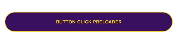
.button.loading {
    background: #390F5F;
    color: #F7D900;
    border-radius: 120px;
    border: 3px solid;
    border-color: #F7D900;
    padding: 30px 0px;
    font-size: 1.2em;
    text-align: center;
    text-transform: uppercase;
    width: 60%;
    font-weight: 500;
    display: block;
    position: relative;
    cursor: pointer;
    margin: auto;
    text-decoration: none;
}
We use the block property, so we can set the button width and height. We want our button to behave well with the rest of the page, so position it relatively. This means it’ll follow the flow of the page instead of just appearing wherever it feels like.
Finally, we want our users to know that our button is clickable, so we change the default cursor to a little hand icon when they hover over it. No more boring pointers for our button!
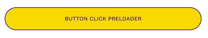
If you want your button to change its style when someone hovers over it, you can do it by writing code for [button-class-name]:hover. But if you don’t want that, just skip this part and move on.
.button.loading:hover {
    background: #F7D900;
    border: 3px solid;
    border-radius: 120px;
    color: #390F5F;
    border-color: #390F5F;
}
Now, pay attention because this is important. We don’t want our preloader to show up until the user clicks on the button, right? So we need to hide it by default by using the display property.
Secondly, if the user clicks on the button again while the preloader is still spinning, we want to make sure that the preloader animation resets. No one likes a stale preloader.
.button span.loading {
    display:none;
}

.button[data-loading] span.loading {
    display:inline-block;
}
Preloader Styling and Animation
We use absolute position here, so the preloader doesn’t go rogue and stays attached to the button. Then, we gave the little preloader bars a splash of color, set their size, and smoothed out the edges with a border-radius property. Here we set four different colors for four mini preloader bars.
Animation property comprises two components, i.e., animation style and a set of keyframes that indicate the starting and ending points of the animation.
.loading-bar {
    display: inline-block;
    width: 5px;
    height: 28px;
    border-radius: 4px;
    animation: loading 1s ease-in-out infinite;
}

.bars {
    position: absolute;
    top: 25px;
    left: 75%;
}

.loading-bar:nth-child(1) {
    background-color: #3498db;
    animation-delay: 0;
}

.loading-bar:nth-child(2) {
    background-color: #c0392b;
    animation-delay: 0.09s;
}

.loading-bar:nth-child(3) {
    background-color: #f1c40f;
    animation-delay: .18s;
}

.loading-bar:nth-child(4) {
    background-color: #27ae60;
    animation-delay: .27s;
}
If you want to use CSS animations, you gotta give it some keyframes to work with. These keyframes are like a script that tells your animation how to behave. They hold information about what styles your element will have at certain times, sort of like a choreographed dance routine.
@keyframes loading {
    0% {
        transform: scale(1);
    }
    20% {
        transform: scale(1, 2.2);
    }
    40% {
        transform: scale(1);
    }
}
When you specify CSS styles inside the @keyframes, the animation will gradually change from the current style to the new style at certain times.
The animation-delay property specifies a delay for the start of an animation. It’s like telling your animation to take a breather before it gets started, like hitting snooze on your alarm clock.
3. JavaScript Code
Ah, JavaScript! The language that makes web pages come to life! Its JS that will animate the preloader upon button click in WordPress.
Let’s break the code line by line to get a better understanding of what’s going on behind the preloader button click animation.
var buttons = document.querySelectorAll('.button');
Array.prototype.slice.call(buttons).forEach(function(button) {
  var resetTimeout;
  button.addEventListener(
      'click',
      function() {
        if (typeof button.getAttribute('data-loading') === 'string') {
          button.removeAttribute('data-loading');
        } else {
          button.setAttribute('data-loading', '');
        }
        clearTimeout(resetTimeout);
        resetTimeout = setTimeout(function() {
          button.removeAttribute('data-loading');
        }, 10000);
      },
      false,
  );
});
The first line of code is setting a variable called buttons to a button class. The document.querySelectorAll() method allows you to select one or more HTML elements based on their CSS selector, and in this case, it’s looking for an element with the class button.
The second line of code is using the Array.prototype.slice.call() method to convert the buttons NodeList into an array so that we can use the Array.prototype.forEach() method to make a loop for a button and add time functionality to it. The resetTimeout variable is then created to clear a timer later on.
Then add an event listener to each button in the array. The event listener is listening for a button click event, and when a button is clicked, it will execute a click function that we define inside this event listener.
When a user clicks on the button, the click function swings into action and does its thing. But what happens if the user clicks on the button again while a preloader is still displaying?
This click function is designed to reset the preloader if the user clicks on the button again while it’s still displaying. Essentially, it’s like hitting the reset button on the preloader.
In short, this function will check if the preloader is currently displaying. If it is, then it resets the preloader and stops displaying it. This way, if the user clicks on the button again while the preloader is still spinning, it won’t keep spinning and spinning like a record on repeat.
The last part of the code sets a timer that will automatically remove the preloader from the button after 10 seconds. If the button is clicked again before the timer finishes, it will clear the timer and start a new one, ensuring that the loading state will only last for a maximum of 10 seconds.
Conclusion
Creating a preloader on button click in WordPress requires custom development using HTML, CSS, and JavaScript. The process involves creating a button, styling it, and adding a preloader animation on the button click event.
The preloader animation is created using keyframes and animation delay properties in CSS, while the preloader button click event is animated using JavaScript.
Using the Elementor page builder makes the process even simpler by allowing us to drag and drop the HTML into the page.