

Pie charts are a perfect addition for WordPress articles used to display electoral results, survey results, or other simple statistics with a limited number of categories.
This article will show you how to create pie charts in WordPress using the UberChart plugin.
When to use a pie chart
Pie charts are commonly used to show the percentage or the composition of a subject. Specifically, pie charts represent the dataset with a circle and the categories with slices.
This particular type of chart is straightforward to use. However, it supports only a limited number of categories and a single dataset. As a consequence, we can’t use it in the following scenarios:
- When the dataset includes too many categories, the reason is that pie charts tend to be confusing when there are more than ten categories.
- If you want to represent data that changes over time. Instead, you can use a line chart or a bar chart in this scenario.
- When your data includes more than one dataset. To represent the data of multiple datasets, you can use for example a bar chart.
- When your data includes both positive and negative values.
Pie charts with WordPress
A dedicated chart plugin gives you many benefits over the use of simple images, for example:
- You can manage all the charts in a centralized place, which is commonly a menu in the WordPress back-end.
- You can modify the chart data when needed.
- You can create new charts from an existing chart, backup your data, or move the charts in different WordPress installations or external programs.
- Charts that use SVG or the HTML Canvas elements are lighter than traditional raster images. As a consequence, there are performance improvements for the website.
- You can generate high-resolution charts (you can only achieve this with a chart plugin that uses dynamic SVGs). This aspect is crucial considering how the monitors and mobile devices market has evolved.
Create pie charts in WordPress with the UberChart plugin
UberChart is a WordPress plugin that allows you to create multiple types of charts, including pie charts. Note that I used this plugin to create custom charts for WordPress in other blog tutorials. For more information, check out the Create bar charts in WordPress and Create Radar charts with WordPress articles.
This plugin technically plots the charts with Chart.js. A JavaScript library that allows creating custom charts with the HTML canvas. On the administrative side of WordPress, you can use the UberChart menus to make the charts. In addition, a dedicated block (or a shortcode as a fallback) allows you to add the charts in the articles.
Create your first pie chart with UberChart
To create a pie chart with UberChart, proceed as follows:
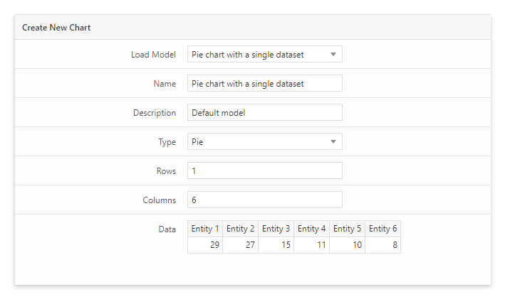
- Assign a custom name to the pie chart. This name will be used later in the editor to reference this chart.
- Select “Pie” with the Type selector.
- Set the number of rows and columns based on the data required by the specific chart. My recommendation is to use one row and less than ten columns for a pie chart.
- Preview the chart in the preview section and apply the necessary changes if required.
- Save the chart by clicking on the “Add Chart” button.
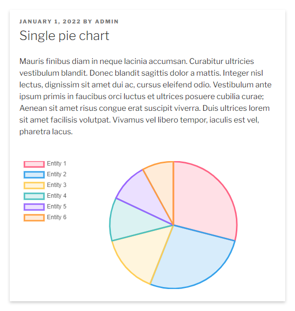
The plugin will save the pie chart at the end of the process. Note that the charts created in this menu can be used later one or more times in your articles.
You can include the charts in the articles with two different methods. The first option is to use the UberChart block available in the block editor to select the specific pie chart that we want to include in the article. The second option is to paste in the article the shortcode associated with the chart.
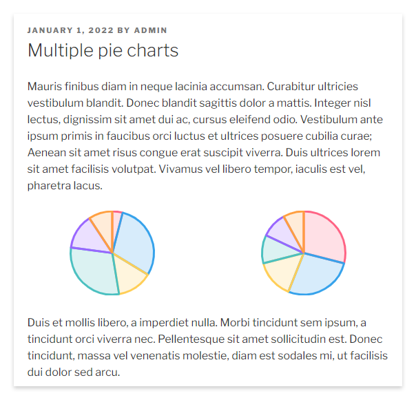
When multiple pie charts are needed, for example, to compare datasets, it’s possible to use the Columns element of the block editor.
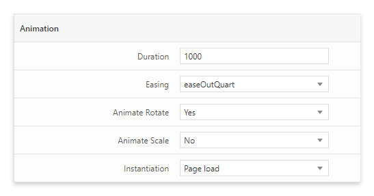
If you like the idea of animating the chart, then you can use the options available in the animation section for this. Here, you can change the animation duration and transition and select whether to apply the rotation and scale effects.
Customize a pie chart
With this plugin, you can also customize the color of the slices and select between different pie chart variations.
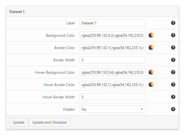
To customize the color of the pie chart slices, open the Dataset section of the chart and use the Background Color and Border Color fields.
If, instead, you want to change the pie chart variation, use the Type and Half Pie/Doughnut options to switch between the variants half pie chart, doughnut, and half doughnut.